It’s true beyond the media industry, too. Airlines, banks and oil companies have merged in recent decades. So have retailers, hospitals, hotels, manufacturers, drug companies and law firms. The resulting behemoths have then taken advantage of their newfound scale, as well as globalization and digital technology, to grow further.
For everyone else, the consolidation boom hasn’t worked out so well. Since the modern merger era began in the 1980s, corporate profits have surged, while family incomes have stagnated and income inequality has increased. Say this much for the corporate executives who argue that a bigger company can be more profitable: They know what they’re talking about.
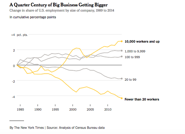
In recent months, I’ve spent some time trying to figure out just how much bigger — as a share of the American economy — big business has become. The question has been harder to answer than I expected. The Fortune 500 ranking doesn’t answer the question, for example, because it doesn’t distinguish between domestic and foreign revenue. And while some good academic work has analyzed consolidation within industries, I haven’t been able to find an economy-wide measure.
So I set out to create one, with help from an obscure Census Bureau data set known as Business Dynamics Statistics. It shows how many American workers are employed by different-size companies, now and in the past.
Read full article