Many Americans can’t remember anything other than an economy with skyrocketing inequality, in which living standards for most Americans are stagnating and the rich are pulling away. It feels inevitable.
But it’s not.
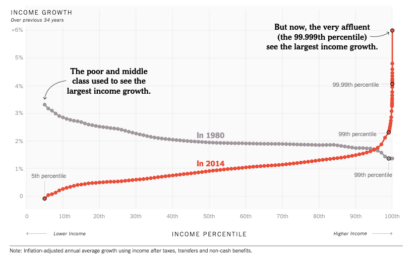
A well-known team of inequality researchers — Thomas Piketty, Emmanuel Saez and Gabriel Zucman — has been getting some attention recently for a chart it produced. It shows the change in income between 1980 and 2014 for every point on the distribution, and it neatly summarizes the recent soaring of inequality.
The line on the chart (which we have recreated as the red line above) resembles a classic hockey-stick graph. It’s mostly flat and close to zero, before spiking upward at the end. That spike shows that the very affluent, and only the very affluent, have received significant raises in recent decades.
This line captures the rise in inequality better than any other chart or simple summary that I’ve seen. So I went to the economists with a request: Could they produce versions of their chart for years before 1980, to capture the income trends following World War II? You are looking at the result here.
The gray line in the chart above, labeled “1980,” shows the change in income from 1946 to 1980. Below, you can watch the change across every 34-year period starting with 1946-1980 and ending with 1980-2014. Each line is labeled with the final year in the period: